Moodboards: more than just pretty pictures
When you hear “moodboard,” you probably imagine a Pinterest collage with dreamy interiors, color swatches, and inspirational images. And yes, it can be visually stunning, but a moodboard in interior design is so much more than a pretty collection.
It’s the part where the home starts to come alive, where the personality of the space begins to show, and where we translate the style vision into something tangible. Think of it as the “Instagrammable” layer of the project (without losing sight of harmony and cohesion).
Why moodboards are key
A moodboard is where ideas start to take shape visually. It helps:
Set a style direction for the home, without being overly rigid
Align your preferences with concrete visuals
Choose colors, materials, textures, and furniture in a way that feels cohesive
Avoid mistakes like combining styles or colors that don’t work together
In short, it’s creativity with purpose.
My moodboard method
Here’s how I turn a concept into a moodboard that both inspires and guides:
1. Collect the “raw ingredients”
I chat with my clients about what they love and also what they don’t. We discuss colors, textures, and styles they’re drawn to, and I often ask them to send me images of interiors they adore. This helps me understand their tastes and personality, while keeping things realistic.
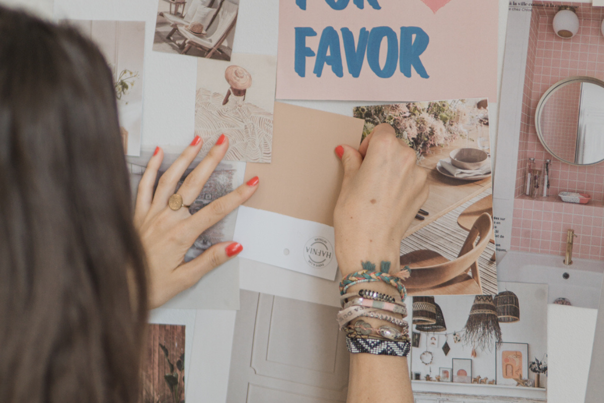
2. Organize & curate
Not every pretty picture makes it to the moodboard. I curate images that fit the overall style direction and reflect what will truly work in the space. This is where I balance creativity with strategy, ensuring the moodboard is inspiring but cohesive.
3. Create the visual composition
I work on two levels:
General moodboard: sets the tone for the whole home. Think of it as the style DNA that ties the house together. Don’t be afraid: it doesn’t mean sage green everywhere just because the client loves it!
Room-by-room moodboards: for each space, I choose visuals, furniture ideas, color palettes, and materials. I also assign two words that reflect the vibe we want to create, like “cosy & elegant” or “warm & airy.” This makes it easy to translate into real design decisions later.
4. From moodboard to perspectives
The moodboard then guides my 3D perspectives. I integrate furniture that fits the chosen style and colorize the drawings with the selected materials and palettes. This step ensures the space feels cohesive, beautiful, and true to the vision we established together.
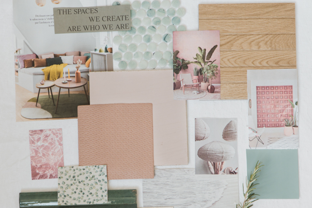
A concrete example: Edith’s home in France
Édith loves sobriety, white tones, and a classic decorative style, but she wants her home to feel cozy and welcoming. She also adores plants and looks forward to adding subtle touches of color.
Palette: soft, natural shades with warm accents like terracotta or ochre
Materials: wood floors, natural textures
Style mix: classic elements combined with modern touches
The moodboard allowed us to visualize the overall vibe of the home while creating detailed inspirations for each room. Every space felt harmonious, reflecting her taste and personality without ever being cold or impersonal.
Key takeaway
Moodboards aren’t just collages of pretty pictures. They’re strategic, inspiring, and incredibly practical. They turn style ideas into tangible visuals, help align expectations, and guide the design process while keeping the personality of the home front and center.